The MTA unveiled a brand-new subway map on Wednesday, and New Yorkers’ reactions to it are, well, all over the map.
The new cartography masterpiece, which features bright colors, new subway stops, and more vivid labeling, is the first major redesign of the iconic map since 1979.
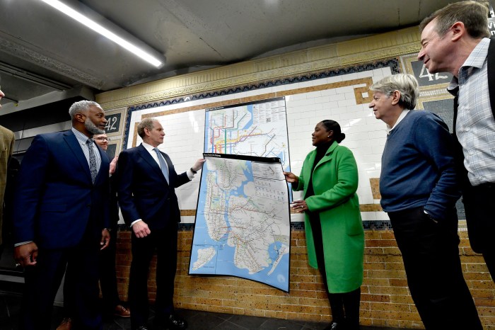
A world-famous symbol of the Big Apple, the subway map is a useful tool to navigate the complexities of NYC’s mostly subterranean transit system.
The new version of the map is getting mixed reactions from New Yorkers and visitors alike.
“I’ve been using the trains for many years and recently started using some new lines, so the map is very important to me,” a 7 train commuter named Jeff said.
He also pointed out that the new map looks “very similar” to the previous one, which is a nod to the MTA’s designers.
The agency’s creative team drew inspiration from previous maps, including the familiar one New Yorkers have known for almost 50 years. Workers saved the official brand colors and aesthetic used in previous maps to create the new masterpiece that is now digitally adorning the interior of subway cars, stations and print materials.
Jenny, who is from the Midwest, said that coming from a state that does not have subways, there are too many to figure out.
“I like the color coding, but it looks scary that there are so many,” she said playfully. “I think it breaks it down easier for people who take the subway often, though.”
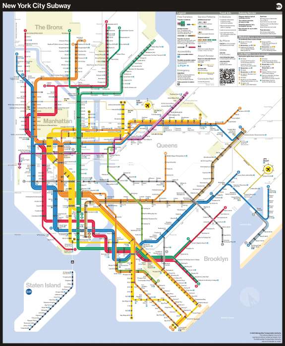
MTA officials said the creative team consulted with various accessibility groups to create the new map, which features ADA stations more prominently than the previous map.
Designers also focused on text legibility, keeping text on one line wherever possible, making better use of open space to alleviate crowding, and using a black subway bullet with a white character to provide maximum contrast for easier reading.
Miriam Fisher, a Chelsea resident who advocates for disabled New Yorkers who use the transit system, underscored the importance of consulting with various groups to create a redesigned map.
She said she likes the new map’s brighter, bolder, and thicker lines.
“There are multiple design factors that make maps more or less helpful for riders,” she said. “People with visual and spatial impairments, cognitive needs, sequencing, dyslexia, color blindness, etc., all have different strengths and weaknesses.”
The redesign was based on feedback from both commuters and MTA front-line workers.
Brian Fritsch, associate director of the Permanent Citizens Advisory Committee to the MTA, said the new map will make navigating the subways easier for people, no matter how familiar or unfamiliar they are with the system, which is part of the largest transportation network in the county.
“Listening to rider suggestions helped change the map into one that is reflective of the lived experiences of New Yorkers, including MTA Board member Andrew Albert – who knows more about the system than many of us ever will,” Fritsch said. “By keeping riders with disabilities top of mind during the development of the map, the new design is sharper and clearer for riders with low vision and contains more information on elevators at stations for the riders who need them.”
Meanwhile, another commuter who was walking toward the 7 train in Woodside, said she uses Google to help her traverse the city trains.
“I was lost finding the 7. But I just use my phone,” she said.


