The subway map, as New York knows it, is now a thing of the past. The MTA unveiled on Wednesday a brand new, detailed schematic of the subway system — the first fully redesigned subway map in nearly 50 years.
“The map that we have used for the last several decades has come and gone,” said Demetrius Crichlow, NYC Transit president, during a press conference in Times Square. “So we’re all excited about this new map.”
The iconic map, which commuters have used since 1979, features an array of changes designed to simplify wayfinding. Transfers are more obvious, so people can more easily figure out where to connect to other trains. The legend is “more detailed and streamlined” in an effort to make navigating the system easier for both New Yorkers and visitors.
ADA stations are more prominently displayed in the new design.

The new map reflects recent changes within the subway system as the MTA continues various modernization efforts, such as new open-gangway trains, accessibility improvements and updated signalizing.
“The new MTA is focused on a quality, 21st-century customer experience, and it’s about time our map caught up,” MTA Chair and CEO Janno Lieber said. “The new version is much easier to read while also reflecting all the enhancements we’ve made over the years.”
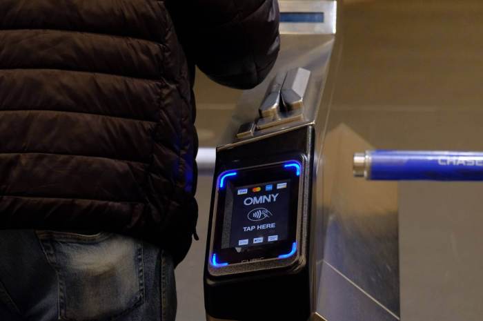
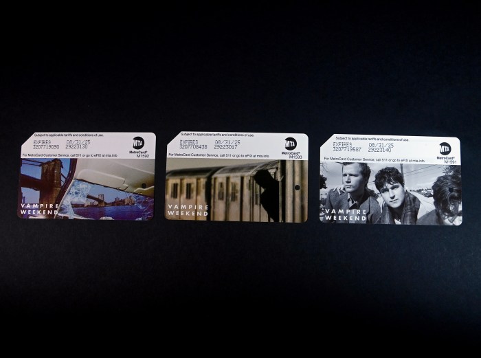
The redesign unfolds just two weeks after NYC said goodbye to another MTA icon: the MetroCard. After a 32-year run, sales for the MetroCard will end on Dec. 31 to make room for OMNY, another subway modernization effort that features contactless tap-and-go payment via phone, credit card or OMNY Card.
The revamped map was designed by the MTA’s Creative Services Mapping Department. It uses a “diagrammatic style” and bold, straight lines that help make it easier for people’s eyes to follow.
Its white background, bold colors, horizontal writing and use of black dots make the map more ADA-friendly and easier for persons with visual limitations and cognitive disabilities to read, MTA officials said.
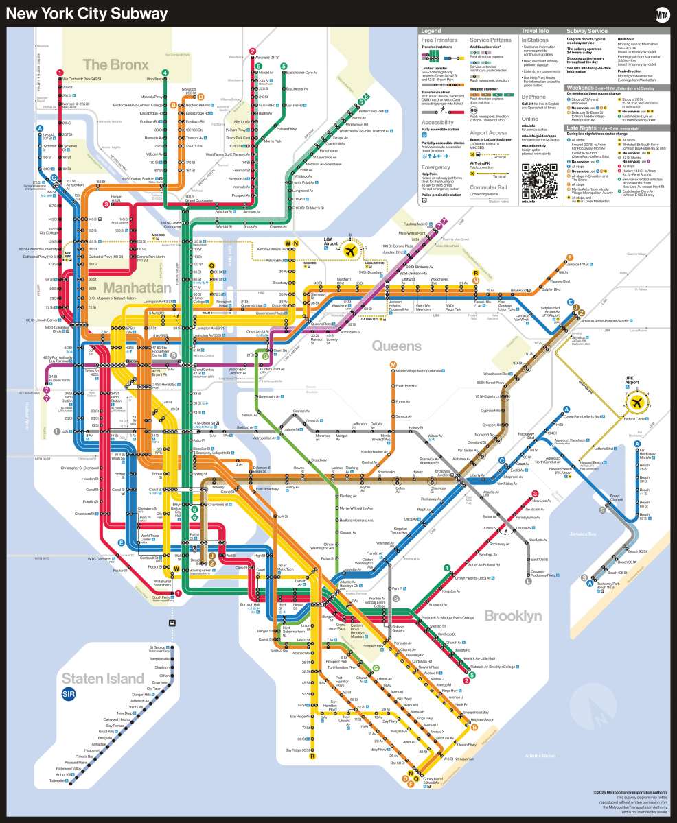
Other new map features include:
- Bold icons that more prominently show airport locations
- More details on what trains go to various transit hubs
- A QR code that leads users to the MTA website
- A legend that has information about accessibility, transfers and safety
- Text on only one line wherever possible and more contrast so letters stand out
The new subway map for weekdays, late nights, and weekends is already displayed on station digital screens and will soon be onboard R211 cars. The MTA said the replacement of physical maps in the remaining subway cars will be done in phases over the coming weeks.
“This map rollout is utilizing the dedicated space in every subway car and the thousands of digital screens in the transit system to provide customers with detailed and up-to-date service information,” MTA chief customer officer Shanifah Rieara said.
The MTA says printed versions of the new map that commuters can hold and take along on their rides will be available in the coming weeks.


