The Fisherman has returned to port.
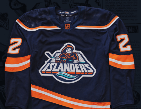
Thursday saw the New York Islanders reveal their Reverse Retro uniforms adorned with a muted version of the famed Fisherman logo that was used for a controversial two years from 1995-1997.
The next era of the Fisherman is here.
Introducing our @Adidas #ReverseRetro 2022
Available 11.15 | #Isles x @adidashockey
Preorder yours starting at 12PM on https://t.co/3e5gLhpyyQ pic.twitter.com/4kH0q7H212
— New York Islanders (@NYIslanders) October 20, 2022
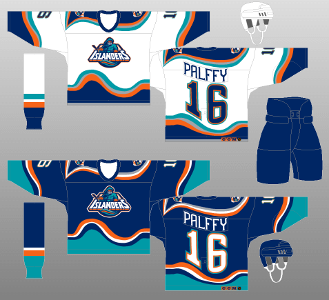
It’s a muted version of the original, which featured more teal and swooping wave designs on the shoulders and the bottom of the sweater, which also had lighthouse patches on the shoulder. The revamp of the jersey features more straight lines and the Fisherman’s complexion changing from orange to silver.
“It’s going to be great,” Islanders winger Anthony Beauvillier told amNewYork. “I love the Fisherman jersey so I can’t wait to see it.”
The Islanders were just over a decade removed from their dynasty of winning four straight Stanley Cups from 1980-1983 and were at a crossroads.
Legendary head coach Al Arbour was gone and John Pickett sold the team to the dubious “Gang of Four” local businessmen who oversaw day-to-day hockey operations and subsequently drove the team into the ground by bringing on Mike Milbury as general manager in one of the most ill-fated moves in franchise history.
In hopes of revitalizing a fan base and opening an avenue for a bit more revenue seeing as fans were not coming out to a crumbling Nassau Coliseum to watch a last-place product, the Islanders went for a total re-brand that has split a fan base ever since.
Drawing inspiration from Long Island native Billy Joel’s hit “Downeaster Alexa” which tells the story of a struggling local fisherman (h/t Nicholas Hirshon’s “We Want Fishsticks”), the Islanders introduced the silver-haired, bearded, stick-wielding, slick-wearing character with a bold uniform featuring waves of orange and teal to accent the navy blue and white color scheme.
For fans that had been with the organization since its inception in 1972, it was sacrilege. The traditional blue and orange with their classic “NY” logo over a map of Long Island is one of the cleanest, nicest set-ups in hockey.
“I don’t understand the appeal of the Fisherman,” Islanders fan Dawn B. wrote to us. “The most loved crest of the jersey was replaced with the Gortons fisherman and fans were mocked relentlessly with ‘fish sticks’ chants as other teams steamrolled the Isles. But sure let’s bring it back.”
For a younger generation first introduced to hockey in the 1990s and after, the bold look provided a change of pace — and many first memories of the uniform had nothing to do with the performance on the ice — despite those two seasons being two of the worst in franchise history.
That included the failed takeover of the fraudulent John Spano, who nearly fibbed his way into owning the Islanders in 1996.
“Just like the four Stanley Cups in a row are a part of the team history, the Fisherman represents a low point in Isles history,” Glory Sporter wrote to us. “To some, it shows that you will be a fan no matter what, but to others it reminder of the worst years for the Isles. It’s nostalgia. For better or worse.”
During the 1996-97 season, the Islanders placed their traditional crest on the Fisherman-style uniforms as a third jersey before it became their exclusive uniform for the 1997-98 season.
And so the Fisherman was lost at sea for the next 25 years — until now.
“I think it’ll be cool,” veteran forward Matt Martin said. “I love our traditional logo but changing it up is always cool to put another jersey in your collection.”


